
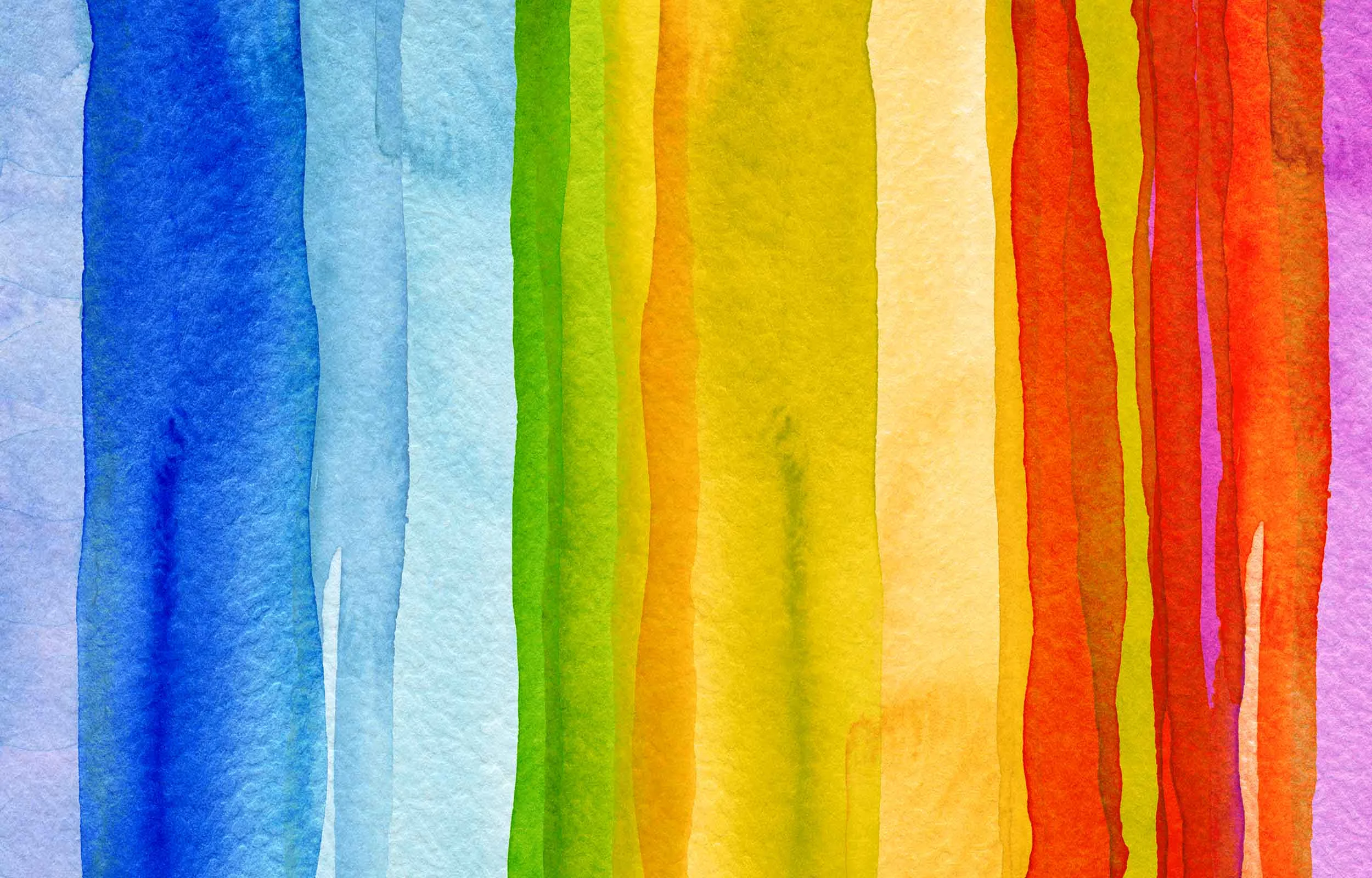
Is your brand sending mixed color messages?
Choosing your brand colors is more than just choosing your favorite shade of blue. Color can influence the perception of your brand, whether it was intentional or not. It can convey the message of brand confidence or value, or provoke feelings of anxiety or relaxation. Color is a powerful tool for communication. There have been numerous studies on how color can affect human behavior, so before you choose your brand colors, make sure the message is clear. Below is a list of colors and what they might represent depending on how they are used. Different color shades or various color combinations can communicate different messages. Additionally, what graphics, branding or logo are the color applied to? A blue floral logo may send a different message than a blue logo for a tire company. Have your graphic designer propose some color or color combination options that will work for your business.
Red
Red is a bold color, it triggers excitement and draws immediate attention. The brain processes red and yellow first (think fast food or emergency room/urgent care). Red increases the heart rate and signals a warning, so don’t use this color for an investment banking company, duh. It’s also a symbol of passion, strength, sex, aggression, speed, desire, courage, lust, impulse, anger and action. Red is bold, rigid, hard and angular, so use it with discretion. However, there are many tints and shades of red, it can be friendly or rigid, and various color combinations can increase or decrease that boldness.
Example of a red color combination
Red combined with blue is a symbol of strength, power, trust, security and tradition. It combines the strength of red with the trust and security of blue. You’ll see this with some banking logos, in politics, and of course, the American Flag (and many other flags around the world.)
Example of a tint of red:
Pink is a tint (mixed with white) of red. It reduces the anger and aggression and is more calming in nature. It’s enlightening, soft, calm serene, cool and tranquil and will attract more traditional buyers.
Blue
Blue is a favorite color of many, it’s reliable, cool, dependable, trustworthy, friendly, calm and tranquil. Many banks use blue in their branding because it’s a sign of trust, security, dependability, power and success. Blue can be harmonious or sad, depending on how it’s used. Dark blue is a symbol of royalty and power, while aqua blue is cool, friendly and calm (think water, sea and sky, ahhhh.) Choose blue wisely, especially if it’s popular in your market.
Example of a blue color combination
Blue and yellow is commonly used in education, combining the success of blue with the optimism and youth of yellow.
Yellow
Yellow grabs your attention and naturally releases serotonin. It’s a symbol of life, optimism, hope, energy, food, intellect, laughter and youth. It’s a happy color, it feels fresh (citrus, lemon, honey, organic), creative and playful. However, yellow is also used as a warning sign, hazard alert, and sends the message to slow down (Yield signs, life vests, hazmat materials) It can be cheap if used incorrectly and can be hard to see. While bright yellow might feel cheap or convey value, a deep mustard yellow can be very modern and high-end.
Example of a yellow color combination
Yellow combined with red communicates urgency. The brain processes these color first. Think fast food: quick, urgent, food, fresh (or the illusion of fresh).
Green
Green is a symbol of nature, ecology, health, luck, generosity, fertility, peace, healing, life, balance, sustainability … the list goes on. It’s a very positive nurturing color. Light shades indicate growth, vitality and renewal. Dark shades indicate wealth, stability, abundance and prestige. On the flip-side, green can also be a symbol of envy or jealousy.
Example of a green color combination
Green and yellow send the message of organic, fresh and healthy food. You’ll see this in restaurants, smoothie stands and health food stores.
Orange
Orange is commonly used as a call to action, sending a message to buy, sell, subscribe and move. However orange is a more friendly option than the urgency or yellow or red. Orange is inviting, warm, affordable, playful, happy, warm, modern and vibrant. It’s also used to convey health (think organic, vitamins and health food.) Orange is often used around the garden or organic products. It’s fresh and youthful. Avoid orange for luxury or tradition.
Purple
Purple is a favorite color among young girls. It’s feminine and romantic and is a symbol of mystery, prosperity, fantasy and dreams. It’s nostalgic and is often used to brand scents, oils, soaps, and beauty products. Purple doesn’t tend to rank for men at all, however, if used correctly (possibly combined with gray, black or dark blue), it can be gender neutral – it’s also a sign of royalty, wisdom, respect, wealth, luxury, problem solving, dignity, abundance, justice and religion.
Black
Black is a sign of luxury. It’s sleek, intelligent, modern and sophisticated. Black communicates authority, power (think suits and executives), but it can also be evil, seductive and secretive.
Gray
Gray is neutral and calm. It’s the color in the “middle-of-the-road” and can calm the rigidity of a color palette. On it’s own, gray can lack energy and be stagnant and indifferent. In fact, gray alone is a symbol of old age, death …. and taxes – Ahh! But combined with another color it can be timeless.
Brown
Brown is natural and reliable. It’s a sign of experience, comfort, nature and friendship. It’s an earth-tone and can be tribal, primitive, wholesome, simple, honest and beautiful. It’s grounded and strong, and can a source of organic elements in your brand. You’ll often find kraft paper or twine added to handmade products, separating it from mass production of packaging and labels.
Example of a brown color combination
Combine brown and purple for an organic romantic and spiritual product such as essential oils. Combine brown and green to convey health, nature and fertility.
Your color combination is an art form that this list can't guide your through. But knowing the symbols of colors and how it could affect human behavior is good place to start. The subliminal messages sent through color is powerful, it can be positive or negative, encouraging or discouraging, and can make or break your logo design.